New Header Contest
I am changing my blog header and can't decide between the Green and the Orange one below.
Help me decide!
Leave in the comments below "Green" or "Orange."
I'm giving away 3 copies of my ecourse "Take This Fear and Shove It!"and will choose the winners randomly!
Voting makes you eligible to win!!!
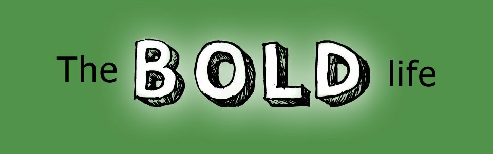
OR
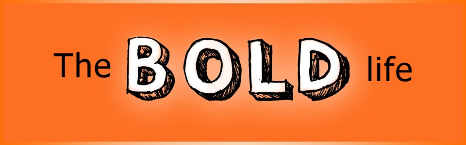
Thanks for you help! I appreciate you. xo
A Shout Out to My Designer: Caroline Manrique from No Wordz Photography!


{ 181 comments… read them below or add one }
← Previous Comments
I think the orange will express your outgoing personality better!
Green
Orange
Go Green!
I think the orange says bold!
GREEN!
Betsy at Zen Mama´s last post…Where Do You Find Your Inspiration? 10 Ways To Find Your Inner Muse
I like orange!
Orange….it’s invigorating!
Orange!
It’s hard to decide…I like them both! Are you planning to keep the other green accents you already have on the site (the outlines, headlines, background of your picture, etc.)? If so, the orange would provide a nice contrast and avoid your site being too monochromatic. But if you’re changing everything and that header’s going to stand alone, then I’d probably pick the green, because I like how the white “glow” behind the letters shows up more on the green one.
They’re both very attractive, though!
Green
orange!!!!!!!!!! so much more bright and outgoing and uplifting!
Orange seems to be the rage right now and I do like it….but I think the GREEN has the grab factor. Go Green -
I like the Green & growing!
Orange for sure!
Hi Tess ,
I think GREEN will synchronize with the title “The bold Life” as Green color signals “Moving on – Going beyond limitations” & that’s what your blog name is all about – Going beyond the self created prisons!
Orange – definitely says bold! I use Caroline Manrique’s services too. Isn’t she great?
Cheers,
Ellen
I usually prefer green, but in this case I think the orange works best!!! It’s bold and beautiful …. <3 Good Luck with your choice.
Has to be the orange,it speaks volumes
I like the green better. Thanks!
Regards, Kevin.
orange
I like the green. Is everything else going to stay the same? The glow behind the letters show more with the green.
Thank you for asking. Great comments and thoughts for the design by everyone.
Green is actually my favorite color, but I LOVE the orange!
I like the green better. It is much easier on the eyes.
~Misty
I like green usually but this ORANGE header attracts me – it’s warm and glowing and happy!
O! R! A! N! G! E!
Orange!
orange
ORANGE! We see green everywhere because its calm,decent or proper. Orange is enlightening, invigorating, eye-catching, and powerfully blowing!
I definitely think orange! It is a color that can’t be ignored and really stands out.
← Previous Comments