New Header Contest
I am changing my blog header and can't decide between the Green and the Orange one below.
Help me decide!
Leave in the comments below "Green" or "Orange."
I'm giving away 3 copies of my ecourse "Take This Fear and Shove It!"and will choose the winners randomly!
Voting makes you eligible to win!!!
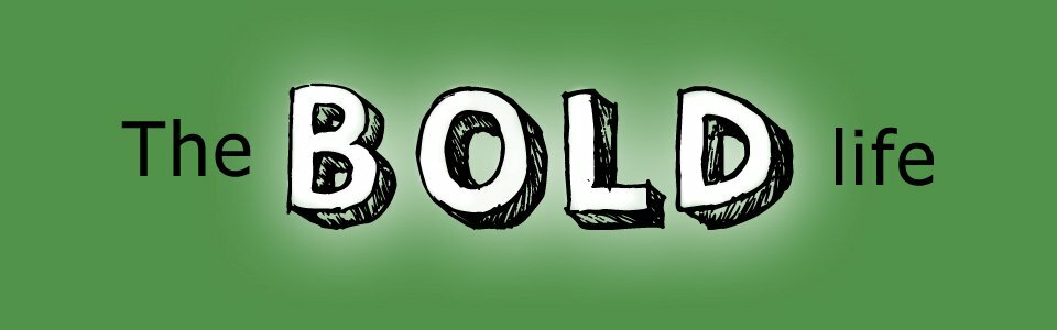
OR
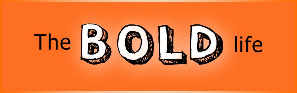
Thanks for you help! I appreciate you. xo
A Shout Out to My Designer: Caroline Manrique from No Wordz Photography!


{ 181 comments… read them below or add one }
← Previous Comments
Orange!!!
Reply
Orange. Fresh and juicy
Marion Driessen´s last post…Curious Nose, Tentative Paw, Soft Fur
Reply
Orange
Reply
green!
Reply
Orange!
Reply
orange
Reply
orange
Reply
orange
Reply
Orange….fresh and full of zing!
Reply
Definitely ORANGE!!! So happy!!
Reply
Orange is a happy color, and good energy as well.
Reply
Orange. Looks good with your complexion.
Reply
Orange. It is much bolder than green.
Reply
Green
Reply
Orange is definitely more BOLD
Reply
Definitely green. Green is earthy. It is calming and relaxing. Reminds me of spring!
Reply
Orange!
Reply
Orange
Reply
Green!
Reply
Orange is Bold, Green is not.
Reply
Green means GO!
Reply
Orange. Very energizing and bright.
Reply
Orange gives a positive impact.
Thanks
V Sureshkumar
Reply
Green …. easier on the eyes.
Reply
Green. I like the shading which makes it BOLD. Green = LIFE
Reply
Orange!
Reply
I like green but orange has more punch to it. Orange is the color for vitality, exuberance and passion – like the sun. And when you think about the sun, most children would also use their crayons to draw in a happy smile.
Nonetheless, I think what matters most is what energy do you want your site to exude. It is also the meaning that you attach to the color that is important.
Evelyn Lim´s last post…How To Let Go of the Past
Reply
ORANGE…much more vibrant and uplifting!!
Reply
Orange! It screams of boldness.
Reply
The colour orange signifies an open-minded approach. It gives vibes of friendship, fun and informality
Green is life. Abundant in nature, green signifies growth, renewal, health, and environment. On the flip side, green is jealousy or envy (green-eyed monster) and inexperience.
I vote orange.
Reply
I like the Green
Reply
Orange, definitely! Orange is very bold.
Reply
Orange
Reply
Orange is much more positive and jumps off the screen!
Reply
ORANGE……PS. LOVE THE SHOES…Thanks so much. Lovingly, Dana
Reply
Orange… it’s new!
Reply
Orange . . . .It is a bolder colour, and grabs the attention, although green is my all time fave!
Reply
Green all the way:))
Reply
I would go with Orange, because it symbolizes happiness,
Reply
Orange …. it’s a BOLD color!!
Reply
OOOOOOrange!
Reply
Green!!!
Reply
Orange makes me happy
Reply
Since most of the *doors* in Ireland are painted standout cheerfull, I will go with *orange*…but mix a ‘wee’ bit of green and white
Reply
orange!!
Reply
Green.
Reply
I think the Orange. Both are great, but the orange one seems bolder to me.
Hugs!
Melody
Melody | Deliberate Receiving´s last post…Dear LOA: How Can I Make My Miserable Friend Happy?
Reply
I like orange.
Reply
Orange
Reply
Orange looks more ‘bold’ to me! I hope I win, I have a lot of fear I would like to shove away.
Reply
GREEN ….I am not keen on the chosen font for ‘BOLD’ or the hatched shading.
The same font for ALL the text would work better, with ‘The’ & ‘Life’ in a smaller size than the ‘BOLD’ as is shown.
Perhaps a frame to border the header would be a good idea?
Reply
← Previous Comments